Over a year ago Brian from EpicEdits did a Blog Project in which he asked his readers to participate by editing one of his photos, any way they wanted do. The results were a great showcase of how differently you can adjust a photo in post-processing. Phil Price has decided to resurrect this idea and is giving his readers a chance to edit one of his photos. Here is the photo: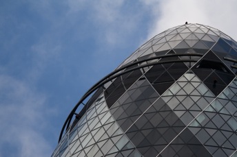
A beautiful shot of a skyscraper in London but relatively bland, which makes it ideal for some more adventurous editing. I’ll show you most of my edits in addition to the one I’m submitting to Phil, since I like all of them.
At first I tried a standard black & white conversion: As you can see, this reversed the clouds and the blue in the sky, making the photo a bit more moody and giving more interest to the sky. But that is also the problem: the sky takes over from the building, shaking the balance out of whack.
Next I did something I often do when I’m not sure what I want to do with a photo – I apply Hydra to it, which lets you tone map even a single image. I was playing around with it to get some extreme results, just to see what I could do to it.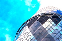
This is a super satuarted version of the photo. The sky is a very comic or catastrophe-like looking color and the building is sporting a lot more colors than are visible in the original. I really liked the color effects on the building and also the very blue color of the sky which was not as overpowering as the black & white. But it is certainly a very extreme version.
I was still playing with Hydra when I got this photo: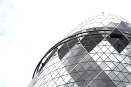 I absolutely love the structural nature of this photo – in fact, it does not look like a photo, more like a drawing or pc concept. but at the same time it is very boring and bland. But what this photo did is encourage me to see what I could do with some layering in photoshop.
Phil supplied the RAW of his photo to give participants the whole range of possibilities in editing the photo. So when I opened the photo in photoshop, I was first taken to its RAW converter app. I decided to play around with the white balance values in there, just to see the effect, which was really interesting and I decided to keep one of them: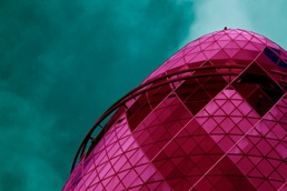 This was the effect of saying that the white balance should adjust it for a cold light source (I think, I also played around with the saturation a bit but I did not change the colors, photoshop did that all by itself 😉 ).
After that I decided to try some of the Photoshop Photo Actions I had found online some time ago and had not tried yet. The first one I tried simulates a Lomo camera: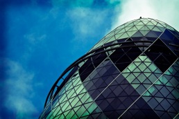 I really liked the vignette for this one and the colors of the building because it looks a lot more lively than it did in the original, but still the sky was not really interesting and due to its highly saturated color is taking over from the building in this version. So on I went to the next action.
I tried a photoshop action called „retro love“ and I really, really like the effect it had on the photo: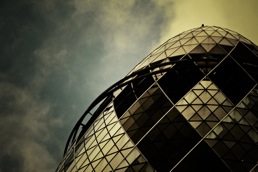 This photo, in my opinion, is very interesting to look at and is not boring. But still I didn’t think it was exactly what I was looking for, because I found it too dark, especially in the corners and in the building itself. Due to this I decided to layer this photo with the very white version I had gotten from Hydra. For the layering I decided to use a gradient from the upper left corner to the lower right corner. I did two versions so I could see the effect it would have to layer it differently.
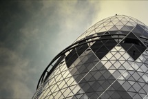
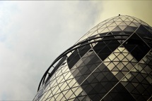 As you can see, the effect is very different and it creates a very different highlight in the photo. In the first one you immediately focus on the building, in the second one it is the vast sky that takes center stage. This second one made me also wonder about using brushes on the photo and going for a truly different look.
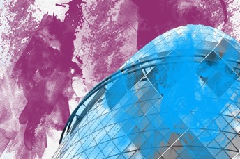 The two colors are from the cold light version, applied onto a white sky and the building from the image above. Additionally, I applied a light texture to the „sky“ so that it looks more like a piece of paper you would use your water colors on. It is very different and not really well done, I just wanted to see what it would look like 🙂
A lot of talking and a lot of versions for such a small task and still I haven’t shown you my final image. But that is going to change now, here is the photo I am submitting for the project: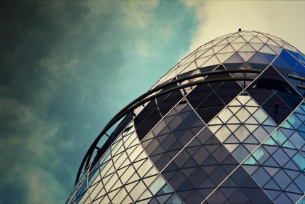
This is also a layered version, using the „retro love“ version and the over-saturated version I got out of Hydra. I think it gives a good balance between interest in the building and interest in the sky and adds a lot more interest to the photo, compared to the original version.
What do you think? Which one would you have chosen?
